Case study:
Brand Strategy, Creative Direction, Shopify Design
Bari J. Designs
LIFESTYLE & E-COMMERCE BRAND CREATED BY ARTIST BARI ACKERMAN
PROJECT SCOPE: Brand & Website Strategy, Custom Shopify Design, Photo Creative Direction, Marketing & Promotional Strategy.
Bari Ackerman is an artist and designer. Through her company, Bari J., she helps people bring joy and beauty into their homes with unique and colorful products.
With experience in creating art for gifts, home decor, fabric, wallpaper, and fine art prints, Bari offers a wide range of beautiful items. Passionate about vibrant patterns and bold designs, she is dedicated to making everyday items both beautiful and purposeful, and her products evoke feelings of happiness and sophistication.
Project Goals
Bari had been running her business successfully but needed a website that truly captured the essence of Bari J. and supported her growing brand.
SHE WAS READY FOR A BRAND STRATEGY & WEBSITE THAT:
Reflected the aesthetics and values of her brand, showcasing the vibrant, joyful, and sophisticated designs she is known for.
Streamlined her shop sections, tagging, and categories, making it easier to manage her Shopify store and create new product carousels quickly.
Integrated all her online content into one cohesive site, combining her shop, blog, and personal brand pages.
Included dedicated pages for her book, press features, and collaborations, highlighting her achievements and partnerships.
Featured a comprehensive creative direction and photo styling guide, ensuring all photography going forward matched the brand’s unique style.
Was easy to update, so she could add new products and content without feeling overwhelmed.
Increased brand awareness, established brand authority, and boosted sales and lead generation, helping Bari J. grow as a global gift and decor brand.
The “Before”
Before we started working together, Bari's website wasn’t capturing the vibrant and joyful essence of the Bari J. brand.
The website had no typography system, or formatting and was confusing.
The shop and blog were on one site, while things like brand collaborations, press features, and other important info about Bari as an artist were on a different site.
This made it hard for people to find what they were looking for and made using the website frustrating. Leading to lower sales, conversions, and collaboration inquiries.
The website also needed better photos to match the high-quality look Bari wanted.
On the back end, The shop sections, tagging, and categories were very disorganized, making it difficult for Bari to manage her Shopify store efficiently. She needed a better system to quickly organize her items and create new product displays easily.
The goal was to make a website that was organized, fun to use, and easy to manage, showing off the true spirit of Bari J.
Bari was ready for a website that could not only showcase her beautiful products but also increase brand awareness, establish brand authority, and drive sales and lead generation.
Brand & Website Strategy
EVERY PROJECT STARTS WITH STRATEGY
This 50-page strategy document for Bari J. outlines a comprehensive plan to create a cohesive and engaging online presence that truly reflects the brand's vibrant and joyful essence. It includes defining the brand’s core values, audience needs, and visual inspiration to ensure a consistent and appealing design.
Core Values and Brand Archetypes: The document emphasizes Bari J.’s core values of creativity, joy, beauty, and everyday luxury. These values are embodied in the primary brand archetype, "The Creator," and the secondary archetype, "The Reveler." These archetypes guide the brand's voice, visual style, and overall user experience.
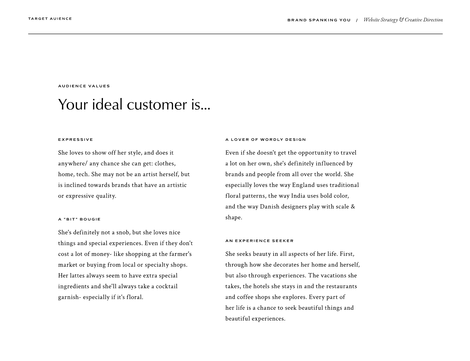
Target Audience: The strategy identifies Bari J.’s ideal customers as individuals who appreciate sophisticated, expressive designs that blend nostalgia with modernity. These customers seek unique, high-quality items that reflect their personal style and creativity.
Visual Inspiration and Design Direction: The strategy provides a clear visual direction, suggesting the use of deep, saturated colors, warm or colored backgrounds, and personality-filled headline fonts to create a distinct and engaging aesthetic. Inspiration is drawn from various sources, including sophisticated vintage styles and bold, maximalist designs.
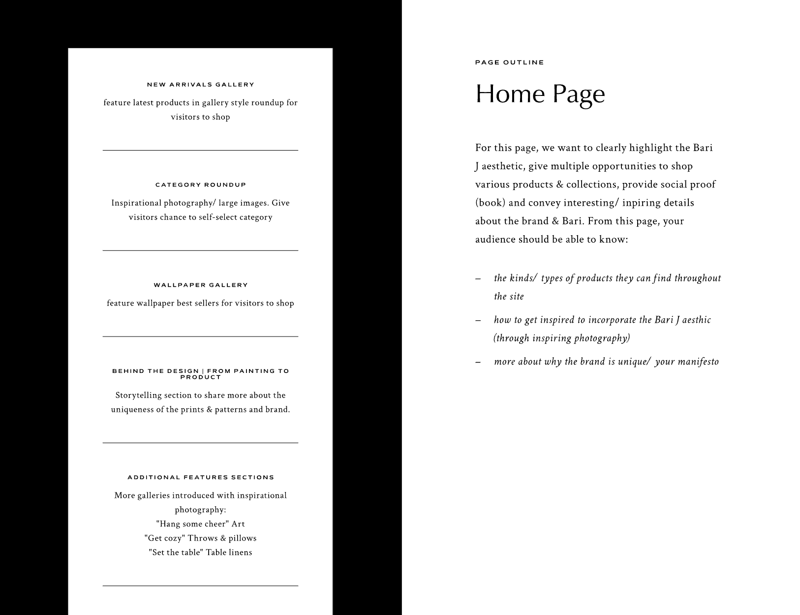
Content Organization and User Experience: There’s also a detailed plan for website organization. This includes key shop sections, storytelling about the brand’s journey and design process, and a dedicated section to house content and information about Bari’s personal brand and how it connects to Bari J. Designs.
Feedback:
“Just delighted! Everything you presented to us has been fantastic to read and look at.”
- Bari Ackerman, Client
Colors & Fonts
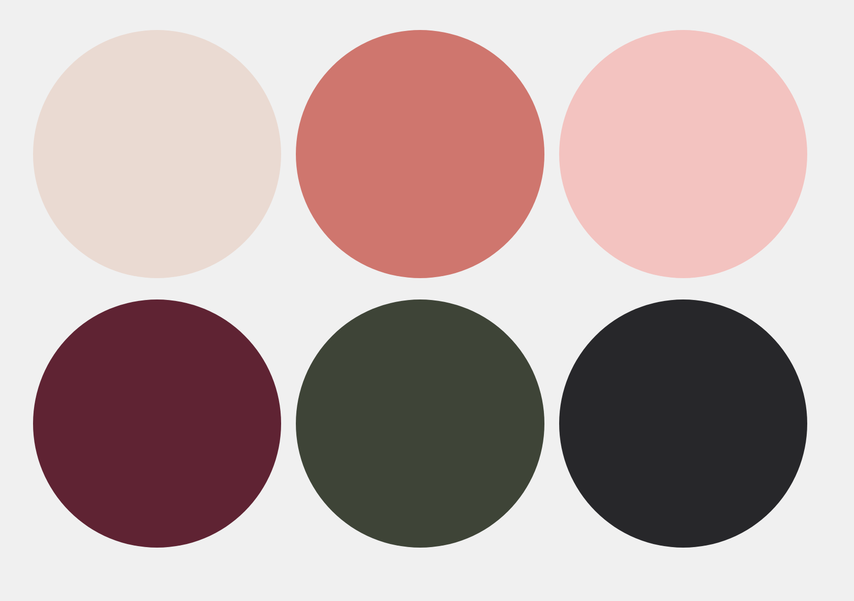
The color palette chosen for the Bari J. website includes:
Deep Burgundy: This rich, deep color adds a sense of sophistication and luxury to the website. It reflects the brand’s commitment to high-quality, elegant design while providing a striking contrast to the lighter tones.
Dark Olive Green: This earthy tone brings a natural, grounded feel to the site, aligning with Bari J.'s love for nature and organic elements. It complements the floral patterns and enhances the overall aesthetic.
Light Cream: This soft, neutral background color creates a clean and inviting canvas, allowing the more vibrant colors to stand out. It provides a harmonious balance to the bold and dark tones.
Warm Coral: This warm, lively color adds a touch of playfulness and joy, reflecting the brand’s vibrant and joyful essence. It helps to energize the design and attract attention to key elements.
Charcoal Black: This strong, neutral color adds depth and contrast to the palette. It is used to highlight text and important features, ensuring readability and visual impact.
Soft Pink: This gentle, feminine color adds a whimsical and nostalgic touch, enhancing the overall feeling of joy and beauty. It ties together the more vibrant and subdued tones, creating a cohesive and balanced look.
Together, these colors create a sophisticated yet playful palette that captures the essence of Bari J. The mix of deep, earthy tones and lively, warm colors reflects the brand’s commitment to creating unique, expressive, and joyful designs.
The fonts chosen for the Bari J. website are Caseopia and Tenor Sans. Caseopia, used for the headlines, is a font with a lot of personality, featuring many curves that give it a modern yet nostalgic and romantic feel. This choice adds a unique and expressive touch to the site, perfectly reflecting the brand’s vibrant and artistic essence.
Tenor Sans, used for the subheadings and body copy, has a vaguely Art Deco vibe that brings a hint of sweet nostalgia without overwhelming the design. It feels modern yet classic and ensures readability, creating a balanced and engaging typography that complements the overall aesthetic of the site.
Creative Direction & Photography
Bari was already good at taking photos for her social media, but she wanted to make the images for her website even better.
At first, we talked about me flying to her in North Carolina to take the photos, but I knew she could do it herself or hire someone local, AND I wanted to create something that would empower her to create gorgeous photography on an on-going basis- which is what she needed.
So, I made a detailed Photo Creative Direction document to help her.
This guide was made to ensure that the website’s photos matched the overall brand look. It included instructions on how the photos should look, a list of shots with styling ideas for all her products, and a guide for preparing and doing photoshoots.
This document helps Bari take great, on-brand photos that make her website look amazing and keep everything looking consistent with her brand.
The final photos look amazing, and now Bari feels confident producing imagery for her brand on an on-going basis.
Copywriting
Bari decided to write the website copy herself, with my guidance. I wrote the main headlines and gave her prompts to help fill in the rest of the content.
We established the tone and style at the start of the project with the brand and website strategy. This was important to keep the copy consistent and appealing to Bari J.'s target customers.
The Website
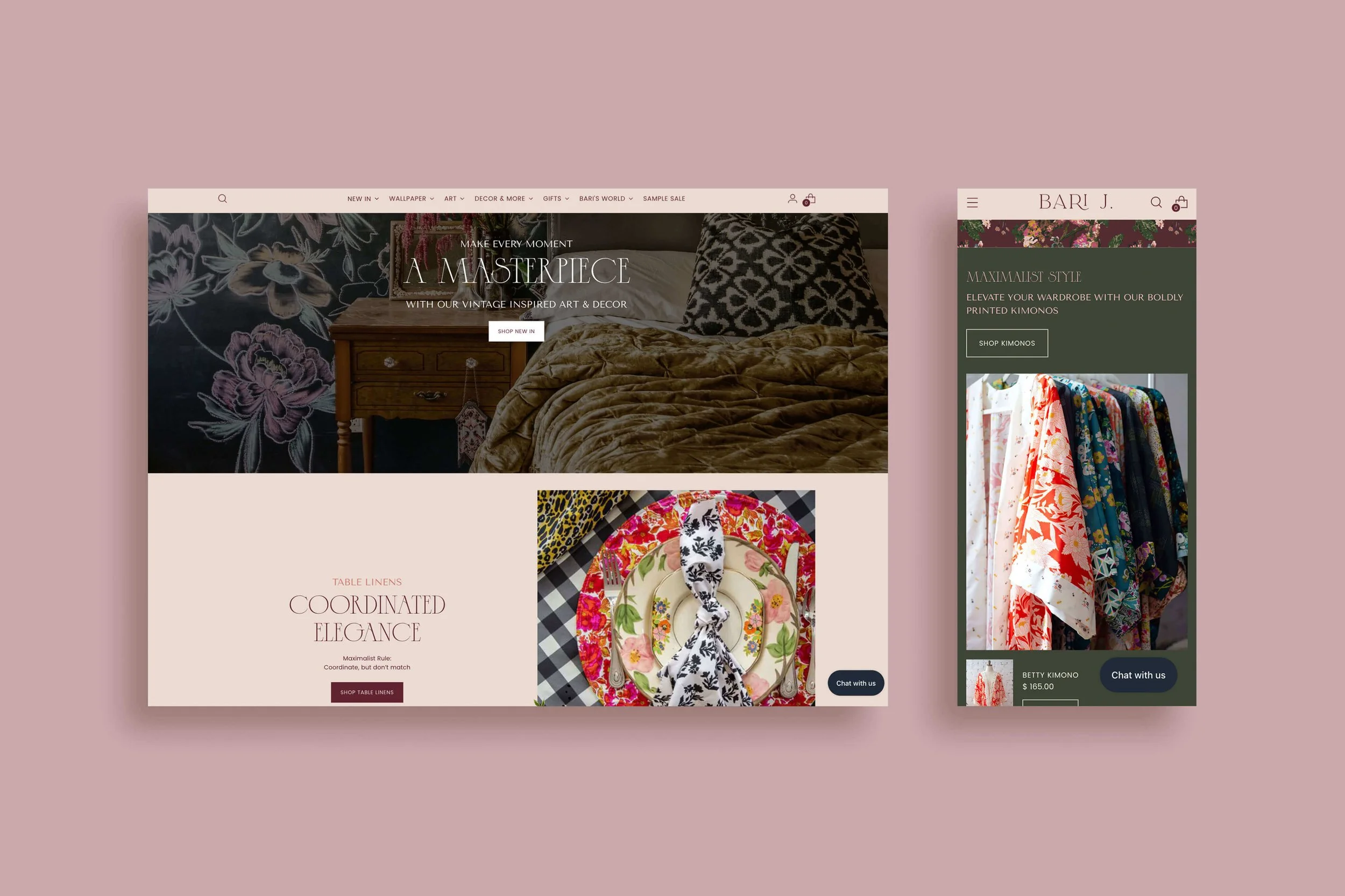
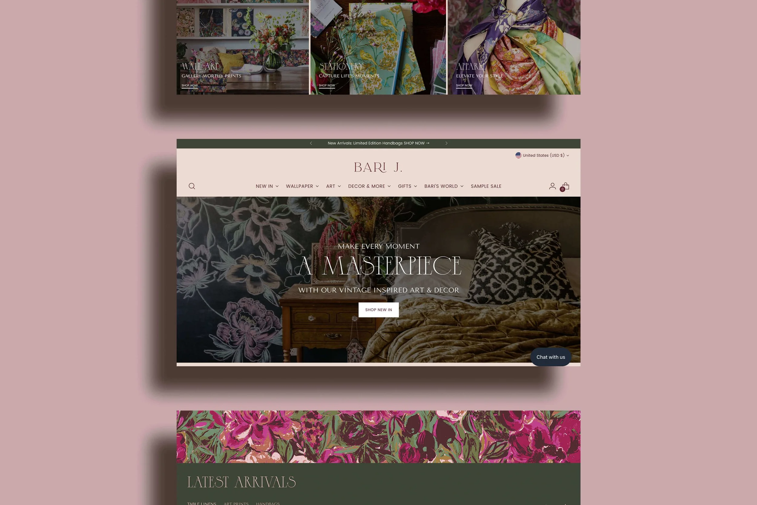
The new Bari J. website combines beautiful design with functionality, ensuring that it is not only a joy to visit but also an effective tool for growing the brand.
THE COMPLETED SHOPIFY SITE IS MADE UP OF SEVERAL KEY ELEMENTS:
Core Pages: Home, About, and Story of the Brand pages that introduce visitors to Bari J. and her vibrant, joyful design philosophy.
E-commerce Focus: A well-organized shop featuring Bari's art prints, home decor items, fabric, and other products, with easy navigation and product discovery.
Additional Content: Dedicated sections for the blog, book page, licensing partners, collaborations, and press features to highlight Bari's achievements and partnerships.
A mega menu was utilized to effectively organize all the content and create a smooth experience for customers navigating the site. This menu ensures that visitors can easily find what they are looking for, whether it’s shopping for products or learning more about the brand.Email Integration: Forms and prompts throughout the site to encourage newsletter sign-ups, helping to grow and engage Bari's audience.
Custom Design Elements: Bari’s own illustrations and patterns were used throughout the site, infusing it with her unique artwork, spirit, and brand. These design elements make the site visually engaging and true to the Bari J. aesthetic.
Feedback
“I understand my brand better than I did before we started, our sales are up, and we are seeing more audience trust than before. It's validated the brand.” - Bari Ackerman, Client
Additional Deliverables
PROMOTION & MARKETING STRATEGY
The Promotion and Marketing Strategy for Bari J. is a detailed plan to help the brand get more attention, connect with people, and sell more products. This plan is important for Bari J. because it explains how to promote the brand on social media, through emails, by working with others, using blog content, and through public relations.
The plan includes ideas for using Bari’s unique paintings and patterns to make eye-catching content that her audience will love. It also talks about the importance of building an email list to keep in touch with customers and encourage them to buy again.
By following this plan, Bari J. can make sure the brand’s message is clear, attract new customers, and grow the business.
The Results
Bari felt an immediate boost in motivation to work on her business after launching a website that truly reflects her brand.
SOME PROJECT HIGHLIGHTS
DELIGHTED BY THE TRANSFORMATION
Bari was seeking a website that captured the aesthetics and values of her brand, and the results exceeded her expectations. From the brand strategy to the final website design, she expressed being "delighted" and "impressed" at every stage. The comprehensive strategy, combined with custom design elements and cohesive organization, resulted in a website that not only looks stunning but also perfectly captures the spirit of Bari J.
CONFIDENT & EXCITED ABOUT THE BRAND
Throughout the process, Bari's confidence in her brand and its potential grew significantly. She felt that the website and materials created were "beyond anything [she] ever imagined" and gave her "even more excitement and confidence about growing the brand." This newfound confidence has empowered her to share her vision and offerings with her audience more effectively.
CLARITY & VISION FOR THE FUTURE
The project provided Bari with a deeper clarity of her vision, target customer, and the direction she wants Bari J. to take. The structured approach to the brand strategy and the development of the website and materials helped her organize her thoughts and goals, resulting in a more focused and strategic brand.
ENHANCED USER EXPERIENCE & ENGAGEMENT
The custom mega menu, along with interactive elements like sticky sections and hover effects, created a dynamic and engaging user experience. The use of Bari's own illustrations and patterns throughout the site highlighted Bari J.'s unique identity, ensuring the site stands out and effectively communicates the brand’s essence.
STREAMLINED CONTENT CREATION & MANAGEMENT
Bari appreciated the comprehensive creative direction and photo styling guide created for the site. This guide has enabled her to produce consistent, on-brand photography, making it easier to maintain a cohesive visual identity across all her products and content. This has streamlined her content creation process, allowing her to focus more on delivering value to her customers.
LOOKING FORWARD TO FUTURE SUCCESS
Since the website launch, Bari has seen an increase in positive feedback, sales, and audience engagement. The new site has not only enhanced brand awareness but also established Bari J. as a leading name in the gift and decor industry. With a solid foundation in place, Bari J. is poised for continued growth and success, ready to attract and engage more customers.
Testimonial
“Sarah has a magic. She reflects to you who you are at your very best. This makes her able to create a brand experience tailored uniquely to you.”
“I can honestly say that you are getting your money's worth and more with Sarah. She is unique in that she is an artist and brand expert. She sees life artfully. She's able to pick out the best of a brand and express that visually as well as in words.”
Let me help you stand out online with a stunning & engaging website.
I make brands and websites that look amazing, help you connect with the right people, and grow your business.
Check out my Services page to see how we can collaborate on your next project.
Already know you’re ready to get started?
Click below to fill out a project inquiry form and let’s bring your vision to life.


