Case Study:
From Blog to Book to Branded Packaging
A long-term creative partnership that shaped the visual world of a cult-favorite brand.


Drinking With Chickens
OVERVIEW
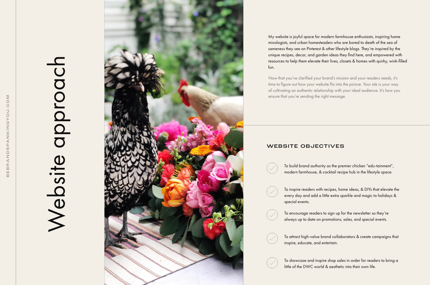
Drinking With Chickens began as creative lark, evolved into an Instagram phenomenon and blog, and grew into a lifestyle brand with a published book, online shop, and devoted following.
Founder Kate Richards had an unmistakable voice, a bold personality, and an audience that loved her chaotic-chic chicken-and-cocktail lifestyle. But while her Instagram oozed personality, her broader online presence struggled to reflect the same humor, cohesion, and elevated vibe.
Over the course of several years, I partnered with Kate as a fractional creative director, providing design strategy, visual styling, and brand support across her website, book styling & photography, packaging, and shop.
Together, we built a brand experience that matched the energy of her content, translated seamlessly across mediums, and supported her as she expanded into products and publishing.

What the brand needed
WHEN WE STARTED WORKING TOGETHER, KATE HAD:
A wildly distinct voice and visual sensibility
An enthusiastic audience on Instagram and growing list of brand partnerships
DIY photography skills and a strong personal aesthetic
Product ideas and a pending book deal
BUT SHE NEEDED:
A website that better reflected her brand personality
A strategy for organizing her many offerings (content, partnerships, book, shop)
Packaging and visual systems that carried her aesthetic into products
A creative partner who could translate her humor and chaos into a cohesive brand experience
Creative Partnership Timeline
Phase 1: Defining The Visual Vibe
Kate had a clear aesthetic, but needed help refining it into something extensible.
We worked together on styled content for her blog and Instagram that became foundational to her visual identity.
Styled lifestyle shoots: cocktails, chickens, garden parties
Developed brand tone: saturated, maximalist, irreverent, editorial
Built a photo library that reflected her voice beyond social media
Visual Direction Highlights
Inspired by vintage garden party chic and bold magazine spreads
Color palette pulled from cocktails, foliage, and vintage textiles
Typography: high-contrast serif meets playful caps
Image direction: chaotic elegance with layered storytelling
Brand Partnership Event


Styled Blog & Instagram Photo Shoots


“Hen Party” Bridal Shower Featured In Country Living Magazine


Styled Event Photo Shoots For Content


Phase 2: Strategic Website Redesign
Kate’s growing content and new business avenues were growing her website beyond just a blog.
Her site needed to organize her brand and create a clear, delightful user experience.
I redesigned her Squarespace site to be equal parts functional and fun.
SHE NEEDED A STRATEGY & WEBSITE THAT:
Accurately reflected the brand and personality of Drinking with Chickens, showcasing its colorful, quirky, and elevated style
Unified her Shopify store and Squarespace site to create a seamless and integrated user experience
Improved navigation and organization, making it easy for visitors to find lifestyle content, recipes, the blog, shop, press features, and the book page
Increased user engagement and satisfaction, reducing complaints while enhancing the browsing and shopping experience
Attracted more visitors and conversions, driving traffic to the site and boosting e-commerce sales
Served as the main hub for Drinking with Chickens, reducing reliance on social media while building a hub for sponsored content, press opportunities, and future book deals.
The Website “Before”
BEFORE OUR COLLABORATION, KATE’S SITE WAS:
Disconnected from her Instagram presence
Hard to navigate, with overlapping content types that felt clunky and left visitors confused.
Lacking a strong visual system
Not reflective of her fast-growing momentum as a personality and brand
It needed to cover a lot: lifestyle content, a blog, recipes, a shop, press features, and a book page. This made the site disorganized and hard to navigate.


The brand, Drinking with Chickens, is joyful, whimsical, and full of flowers. While this was shown in the photos and content on social media, the website felt plain and boring, except for the photos.
Also, the website was actually two different sites: one on Shopify for the shop and one on Squarespace for everything else. These sites didn’t work well together, so it was clear when visitors were moving from one site to another, leading to confusion and mistrust. Kate wanted everything to feel like one seamless site.
“Before working on this project, my website was a mess. It was disjointed, hard to find anything, & the whole thing felt boring. I knew it didn’t show the fun and quirky vibe of Drinking with Chickens.”
-Kate Richards, Client
Website Redesign Process & Strategy
STRATEGY
This detailed brand & website strategy document outlines how to create a website that fully captures the joyful and whimsical essence of Drinking with Chickens.
The focus was on aligning the website with the brand's core values, mission, and goals: to entertain and inspire with fun, creative content and to seamlessly integrate the Shopify store and Squarespace site.


THE STRATEGY INVOLVED:
Understanding the Brand's Essence: Emphasizing the fun, whimsical, and floral aspects of the brand, ensuring the website reflected the same vibrant energy found on social media.
Creating a Seamless Integration: Developing a unified look and feel for both the Shopify and Squarespace sites, including custom-coded headers and footers to ensure a smooth user experience.
Organizing Content Effectively: Planning and strategizing the site layout to organize a wide range of content, from lifestyle blogs and recipes to the shop and press features, making it easy for visitors to navigate.


Strategy Feedback:
“This is an absolute spot-on grasp of my brand’s vibe. I am ded- can’t even give feedback because I love this so much.”
-Kate Richards, Client
Website Visual Direction
The visual inspiration for the Drinking with Chickens site redesign drew from several key stylistic choices and categories:
Bold, Quirky Illustrations: Inspired by designs that use playful and vibrant illustrations, the site features bold florals, interactive animations, and quirky-sweet touches like illustrated page loading graphics. These elements add a sense of fun and surprise, reflecting the whimsical nature of the brand.
Layered, Sophisticated Collages: The use of layered collage elements invites curiosity and exploration. By combining traditional typography with ample white space, the aesthetic remains elevated and refined. Layered imagery of florals, chickens, cocktails, and people with bright pops of graphic colored elements creates a bold and fun visual experience.

Editorial Layout Style: Distinct sections created with color blocking and photography accented with graphic illustrations and script font lend a fresh, editorial feel. This style ensures that the site is engaging and dynamic, capturing the visitor’s attention.
Modern Typography: A modern take on traditional typography, with large headings paired with smaller typography, creates an elevated, print magazine feel. This approach helps keep visitors engaged with interesting and updated font styles.

The visual inspiration for the Drinking with Chickens site redesign drew from several key stylistic choices and categories:
High Fashion Aesthetics: Saturated, sophisticated, and colorful photography paired with playful typography brings a high fashion vibe to the site. Elements like a logotype with mixed-up colors and bold photography layered with sophisticated type add a stylish and polished touch.
Colorful, Interactive Elements: Bright pops of color, interactive animations, and colored background sections modernize the traditionally feminine color palette. These elements make the site feel lively and inviting, perfectly capturing the joyful and whimsical spirit of Drinking with Chickens.

These stylistic choices helped shape a visually stunning & cohesive site that truly reflects the essence of Drinking with Chickens, making it a joyful and engaging experience for visitors.

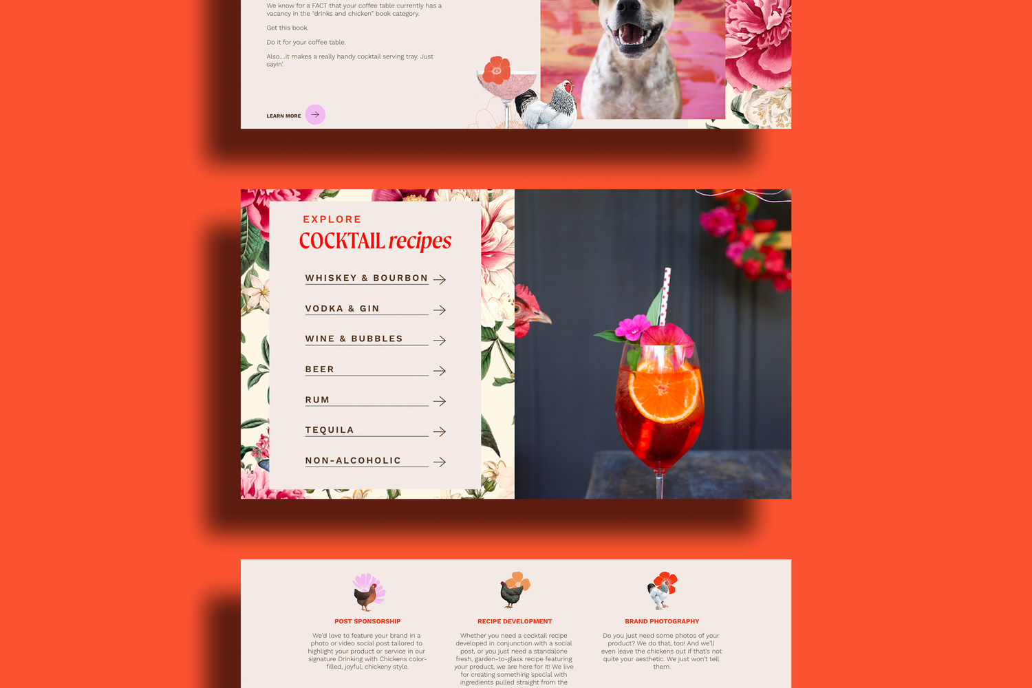
The “After” Website
KEY ELEMENTS OF FINISHED SITE:
Custom Mega Menu Navigation: A thoughtfully designed mega menu ensures that visitors can easily navigate through the extensive content, from lifestyle blogs and recipes to the shop and press features. This navigation design keeps the site organized and user-friendly.
Seamless Integration of Shopify and Squarespace: By integrating the Shopify store with the Squarespace site, we created a smooth and unified shopping experience. Custom-coded headers and footers ensure that visitors never feel like they’re leaving one site for another.
Interactive and Engaging Design Elements: The site features sticky sections, hover image and text effects, and bold collage elements that add dynamic visuals and keep users engaged. These interactive features enhance the user experience, making the site lively and fun.
Dedicated Book Page: A special page is devoted to Kate's book, "Drinking with Chickens: Free-Range Cocktails for the Happiest of Hours." This page highlights the book with sample pages and guides visitors on where to purchase it, effectively promoting this key product.
Favorites Feature: The new "favorites" section showcases Kate's favorite things, organized into categories. This roundup not only provides value to visitors but also generates extra affiliate income through clickable links.
Revamped Press Page: The press page has been completely redesigned to feature past media coverage and make it easier for new PR opportunities to discover and connect with Drinking with Chickens.
Organized Recipe Library: The vast recipe library has been reorganized to make recipes easy to find and accessible. This system puts the recipes front and center, enhancing user satisfaction and engagement.


Feedback
“This is MAGICAL!!!!!!!!!!!! You are a goddamned website wizard. You rolled everything we talked about into a website that is truly representative of me and my quirky business.” - Kate Richards, Client
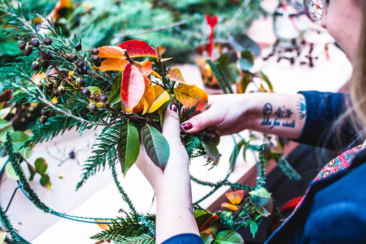
Phase 3: The Book
As Kate developed her book Drinking With Chickens: Free-Range Cocktails for the Happiest Hour, I joined as a stylist, photographer, and creative cheerleader.
KEY BOOK MILESTONES:
Styled and shot select cocktail and lifestyle images for the book
Consulted on visual continuity with her online presence
Provided feedback and support throughout the publishing process


Kate’s Book Acknowledgment
“Very Special thanks to Sarah Ehlinger for stepping in to help me with styling and photography on multiple occasions; your creativity and eye never cease to amaze and you are always so generous with your time. I appreciate you more than you can know.”


Phase 4: Packaging + Shop Expansion
As she launched physical products (pins, cocktail kits, apparel, accessories), I helped translate her established visual language into a tactile, shoppable experience.
MY ROLE:
Designed the full Shopify-based shop, ensuring seamless brand alignment with the main lifestyle site and blog.
Created packaging and shipping materials including shipping boxes, mailers, tape, custom stickers, and tissue paper with a strong, consistent look
Maintained the humor and vibrancy her audience expected across digital and physical formats
Note: Product concepts were all Kate’s—I supported execution and branded experience design.


My Role: Fractional Creative Director
THROUGHOUT THIS PARTNERSHIP, I’VE ACTED AS KATE’S:
Design strategist
Website and UX lead
Stylist and photographer
Packaging and shop designer
Creative advisor and hype woman
Rather than working project-by-project, my role has been to guide the evolution of the brand’s entire visual system—and make sure everything from site to shelf feels like Drinking With Chickens.
The Results
Since our collaboration began, the brand has:
Grown a multi-platform audience
Launched a book
Built an unmistakable visual brand across digital and physical formats
And more importantly:
It looks, feels, and sounds like Kate—everywhere her audience interacts with her.
TESTIMONIAL
“This was the best investment I have made on my business. Sarah is an absolute creative genius and I cannot recommend her and her services enough.”
Want to Build a Brand with This Kind of Depth?
If you're a founder or creator looking for a creative partner to bring your story to life—visually, strategically, and cohesively—I’d love to help. This is what creative direction looks like when it’s built to evolve with you.