Case Study:
Squarespace Design, Brand Strategy
Rooted Connections
EXECUTIVE LEADERSHIP DEVELOPMENT FOR WOMEN IN THE BEVERAGE INDUSTRY
PROJECT: Brand Strategy, Custom Squarespace Design
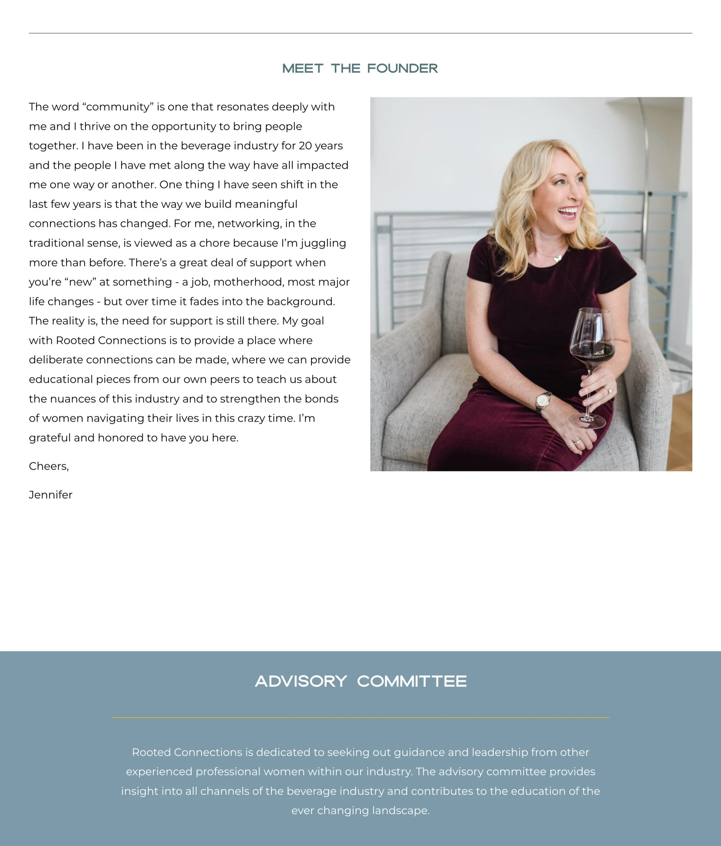
Jennifer Thomas is a seasoned beverage industry executive and leadership coach.
Through Rooted Connections, she helps women in the beverage industry grow in their careers and personal lives with special leadership programs.
Jennifer teaches skills like confidence, leadership, and networking, using online courses tailored to the unique challenges women face in the industry.

Project Goals
After beta testing different versions of Rooted Connections, Jennifer was ready to create a final website that truly showed what Rooted Connections is all about.
SHE WAS READY FOR A BRAND STRATEGY & WEBSITE THAT:
Showed the brand and business she worked hard to build for many years
Made more people aware of Rooted Connections and saw it as a leader in personal and professional growth
Empowered women to grow and highlighted her brand’s core value of giving women more opportunities
Was easy to update, so adding new content wouldn't be hard
Attracted clients who shared her values
Had a combined website and course platform that made it easy to showcase, sell, and provide a great course experience for her students.
The “Before”
Jennifer felt the first Rooted Connections website didn't show her vision or the brand's special value.
The site was plain, didn't stand out, and had few ways for visitors to take action, making it hard for them to understand the message and value.
After trying a test membership program, she saw it wasn't connecting with her audience and needed to pivot. The messaging and site organization needed a big update to show the brand’s new focus on courses.
Jennifer wanted the new site to look professional, reflect her voice, and create a strong connection with visitors
She wanted the website to show her skill in connecting people and to highlight her leadership training + the special programs and resources she offers to women in the beverage industry.
The goal was to move away from the disjointed & uninspiring old site and build a cohesive, engaging, and empowering online space.

Brand & Website Strategy
EVERY PROJECT STARTS WITH A BRAND BLUEPRINT
This 55-page brand strategy document explains how to build a strong and well-known brand that connects with ambitious women in the beverage industry.
It focuses on explaining the brand's main values, mission, and goals: to help women and change the make up of the beverage industry by supporting mid-career women with learning and leadership training.
Rooted Connections embodies the Teacher and Hero Brand Archetypes, aiming to provide guidance, clarity, and inspiration while fostering a sense of community and support.
I also created client personas to help the client understand who the website is for and what they need. This way, we could make the website and messages just right for them.
Feedback:
“This is WAY beyond anything I expected. I’m totally blown away here. I feel like someone finally understood everything I had been trying to say for so long and then organized it all.
BTW I LOVE the archetypes - they are brilliant and perfect, and it got my mind going about how I can create something similar for leadership in the industry.” - Jennifer Thomas, Client
“This is truly more than I ever fathomed and it gives me even more excitement and confidence about launching this.”
Colors & Fonts
I chose a neutral color palette accented with warm colors to accentuate the supportive qualities of the Rooted Connections brand.
The colors are simple and clear like the teacher archetype, but also strong like the Hero Archetype.
To tap into both the Hero and Teacher archetypes and make the website look friendly and supportive, we used a big, all-caps font for the headlines that look strong and expert but still friendly. It’s paired with a modern serif font that looks like the ones in school books.
These fonts are also a nod to typography found on wine and liquor bottles, connecting with the beverage industry.

Stock Photography
The photographic style, inspired by the beverage industry, features images of pouring champagne and sparkling light through glassware, showcasing the celebratory and empowering nature of Rooted Connections.
Singular images reinforce the teacher archetype, and help guide visitors to helpful resources. While celebratory imagery embodies the hero archetype, making people want to take action and achieve their goals.
The colors are warm & inviting, and the wardrobe and lifestyle styling reflect the aspirational qualities Rooted Connections’ ideal client wants to connect with.
Copywriting
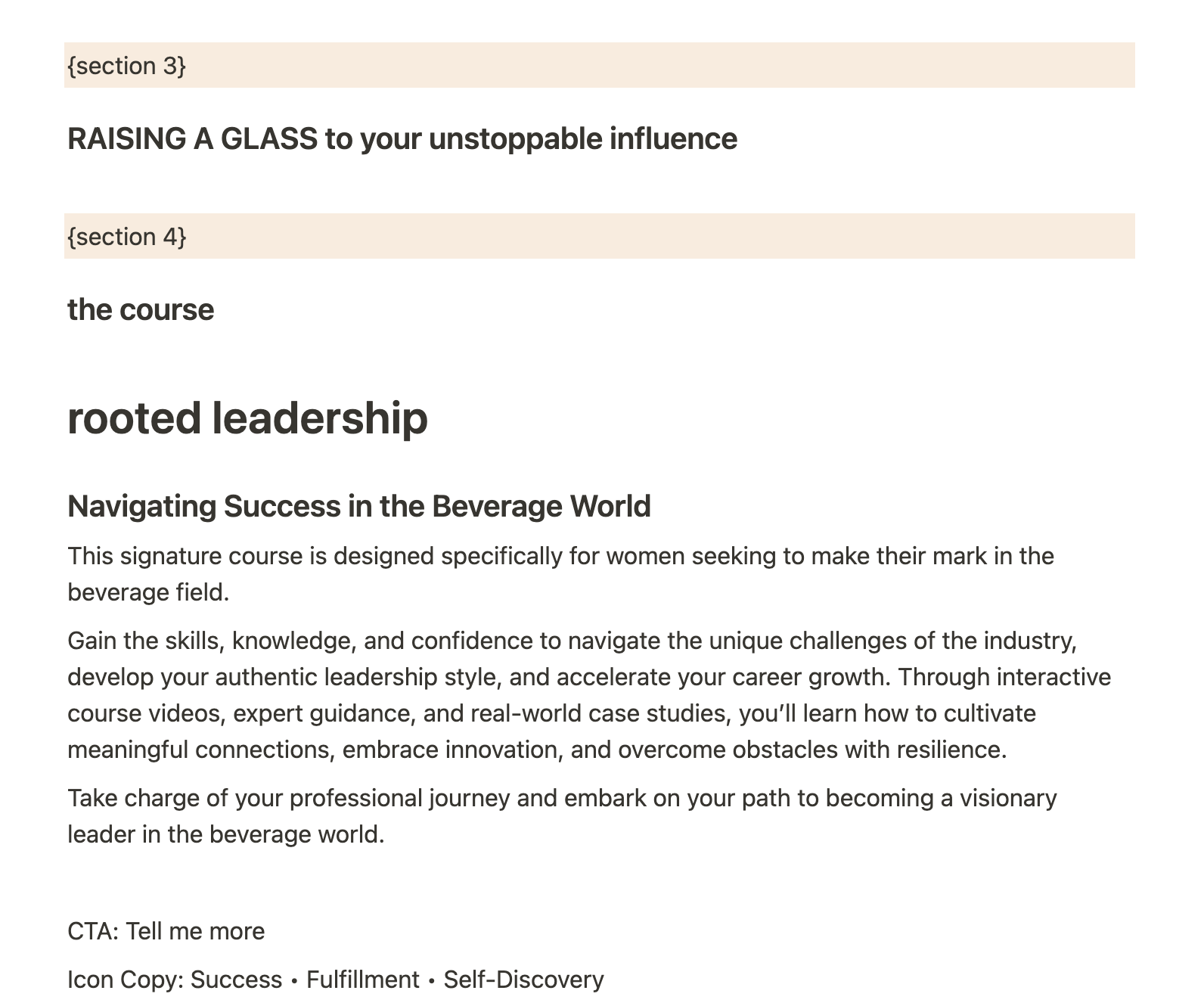
While working together, Jennifer and I collected all the information needed for the website copy. I gave Jennifer helpful writing prompts so she could write most of the body text, while I created strong headlines and key sections.
The Brand Blueprint developed at the beginning helped us find the right voice and style for Rooted Connections' main audience.
I also reviewed and refined the copy Jennifer wrote to make sure everything was clear and polished.

Visual Direction
These design inspirations were used to create a website aligned with the Brand Blueprint:
Strong grids and lines: Convey structure, organization, and clarity, resonating with the Teacher archetype and fostering stability and reliability for customers seeking leadership development and personal growth.
Bold color-blocking and full-bleed sections: Reflect the Hero archetype's boldness and the Teacher archetype’s simplicity and clarity.
Beverage packaging inspiration: Strong typography hierarchy and clean design organization, drawn from beverage packaging as a way to connect with the target customer.
Abstract illustrations: Terra forma or topographical maps inspired by wine bottle designs symbolize being rooted and grounded, aligning with the brand's mission of personal growth and self-discovery.
This combination of design elements ensures the website effectively communicates the brand's values and purpose while appealing to its audience.
Feedback
“I LOVED the topographical element. That’s really brilliant and such a good call. It made me think about having a balance on the website of masculine and feminine energy because there is a part of me that wants women to understand that it’s ok to tap into their masculine energy to help boost their confidence.
I love how this has taken my original idea in such a new direction. As you said in your presentation, you don’t often have to make too many revisions because of the brand blueprint, and you are right.” - Jennifer Thomas, Client
The Website
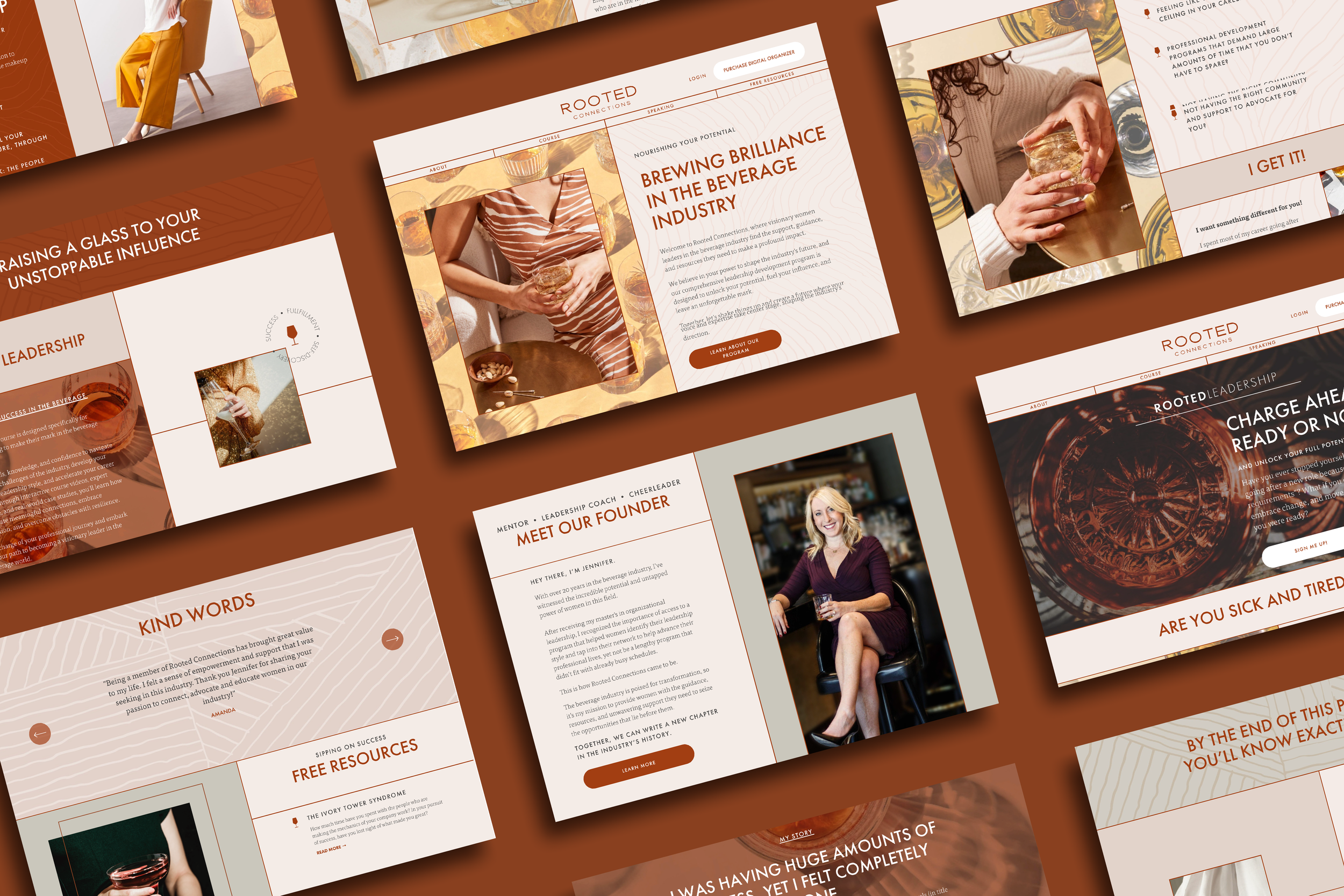
Strategy, colors, fonts, logos, stock photos, copy, and custom coding came together to create an engaging Squarespace website.
This journey guides visitors to free resources, provides ways to connect, and ultimately leads them to sign up for the signature course, Rooted Leadership.
THE COMPLETED SQUARESPACE SITE IS MADE UP OF SEVERAL KEY ELEMENTS:
Core Pages: Home, About, and Speaking- Jennifer wanted to add public speaking as a way to market her business, so I included a speaking page with outlined topics, making it easy for someone to know exactly why they would want to interview her on a podcast or book her to speak at their event.
Free Resources/Blog: A dedicated section for free resources and blog posts to engage and provide value to the audience.
Sales Page: Optimized for conversions, the sales page showcases Jennifer's signature course and integrates the Squarespace course platform for students who purchase.
Email Integration: Integration of an email service provider with Squarespace, including forms and popups to capture leads and build the email list.
Custom Coding: I added custom coding to make the Rooted Connections site unique, with editorial layouts, sticky sections for a dynamic user experience, and a subtle badge illustration and animation highlighting the brand's core values of success, fulfillment, and self-discovery.
Feedback
“Wow wow wow AGAIN! This is incredible and beyond anything I ever imagined. I’m continuously impressed with what you have extrapolated from the initial paperwork I filled out for you.” - Jennifer Thomas, Client

Additional Deliverables
MARKETING STRATEGY CONSULTING
Throughout the project, I helped Jennifer learn the best ways to market the Rooted Connections website.
I advised her on content she could reuse to create a lead magnet, and how to use her existing content to attract and interest her audience.
I also helped her set up her course, giving tips on how to record videos and organize the content for easy learning. Plus, I helped Jennifer create a plan to welcome new students smoothly and professionally.
CANVA TEMPLATES
Besides making the website, I also created extra materials to help the Rooted Connections brand.
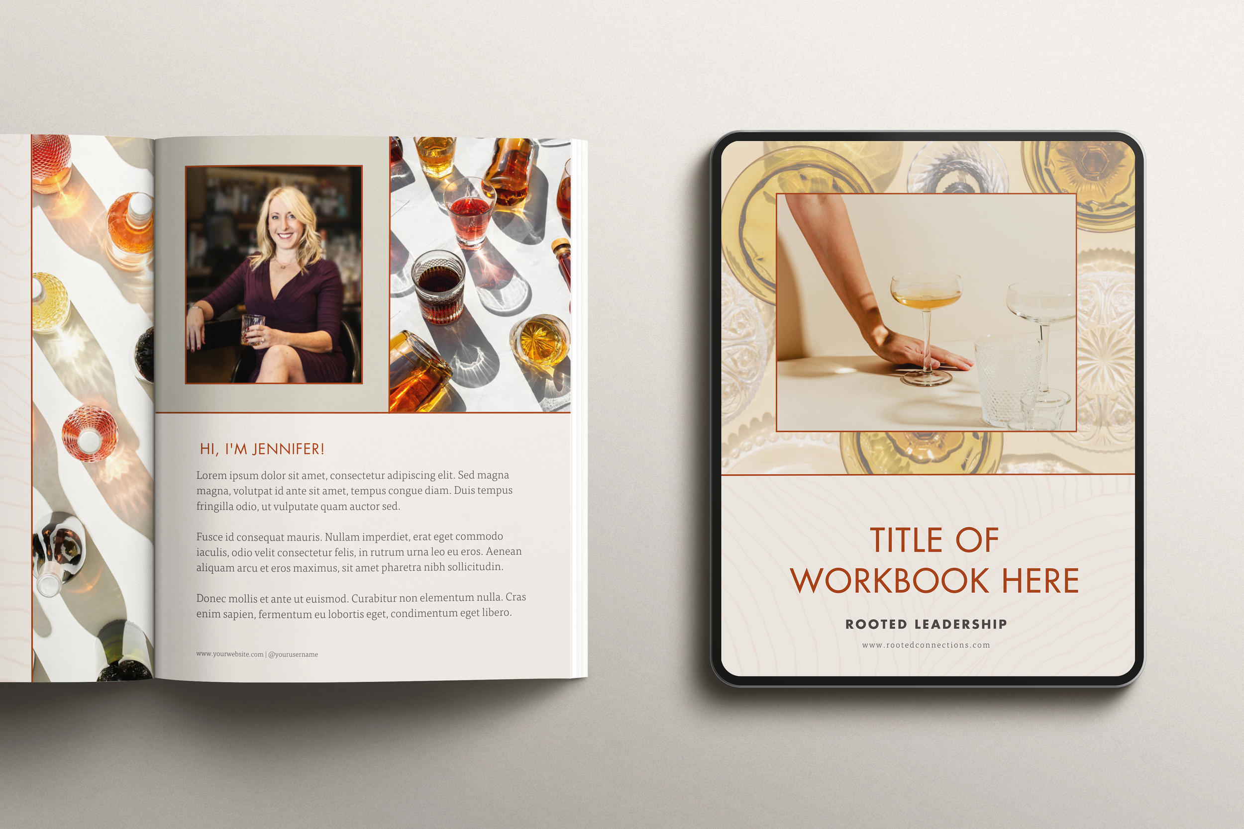
I made Canva templates that match the website's look, so Jennifer can easily create things like lead magnets, course materials, and client downloads like workbooks, worksheets, and planners.
I also made slide decks in Canva for Jennifer to use in her main course. These materials help everything look consistent and professional, making it easier for Jennifer to share high-quality content.
The Results
Jennifer felt an immediate boost in motivation to work on her business after finally launching a website that feels like her brand.
SOME PROJECT HIGHLIGHTS
BLOWN AWAY BY THE TRANSFORMATION
Jennifer was initially seeking a brand relaunch and refresh, and the results exceeded her expectations. From the brand blueprint to the final website design, she expressed being "totally blown away" and "impressed" at every stage. The comprehensive strategy, combined with custom-coded elements and cohesive design, resulted in a website that not only looks stunning but also perfectly captures the spirit and values of Rooted Connections.
CONFIDENT & EXCITED ABOUT THE BRAND
Throughout the process, Jennifer's confidence in her brand and its potential grew significantly. She felt that the website and materials created were "beyond anything [she] ever imagined" and gave her "even more excitement and confidence about launching." This newfound confidence has empowered her to share her vision and offerings with her audience more effectively.
CLARITY & VISION FOR THE FUTURE
The project provided Jennifer with a deeper clarity of her vision, target client, and the direction she wants Rooted Connections to take. The structured approach to the brand blueprint and the subsequent development of the website and materials helped her organize her thoughts and goals, resulting in a more focused and strategic brand.
ENHANCED USER EXPERIENCE & ENGAGEMENT
The custom-coded editorial layouts with vertical and horizontal borders, along with sticky sections, created a dynamic and engaging user experience. The incorporation of Jennifer’s brand icon as a subtle badge illustration and animation highlighted Rooted Connections' core values of success, fulfillment, and self-discovery, ensuring that the site stands out and effectively communicates the brand’s unique identity and mission.
STREAMLINED CONTENT CREATION & MANAGEMENT
Jennifer appreciated the branded Canva templates and slide decks created to match the website's style, making it easier for her to produce cohesive and professional-looking lead magnets, course materials, and client downloads. This has streamlined her content creation process, allowing her to focus more on delivering value to her clients.
LOOKING FORWARD TO FUTURE SUCCESS
While measurable financial results are still forthcoming, Jennifer is poised for success with a solid foundation in place. The new website, combined with her clear vision and enhanced confidence, positions Rooted Connections to attract and engage more clients, ultimately driving growth and impact in the beverage industry.

Testimonial
“Sarah is a genius with words, visuals, & creativity.
The brand blueprint is a game changer and once this is done there are very few refinements that have to be made. She also goes above and beyond to help find the right solutions for your brand. The website, the materials everything is gorgeous, but beyond that,
I now have clarity of my vision, clarity of my target client and a deeper insight into what I really want Rooted Connections to be.”
Let me help you stand out online with a stunning & engaging website.
I make brands and websites that look amazing, help you connect with the right people, and grow your business.
Check out my Services page to see how we can collaborate on your next project.
Already know you’re ready to get started?
Click below to fill out a project inquiry form and let’s bring your vision to life.


