Say Goodbye to Boring Designs: Canva Font Pairing Made Easy
It’s no secret I love Canva- the free design tool that allows you to create beautiful, professional designs in minutes. It's incredibly popular with entrepreneurs and small business owners because of its simplicity, but there are still some things you can do to make your Canva designs stand out even more. That’s where Canva font pairings come in!
The right Canva font combination can instantly elevate your design from good to great—and when it comes to Canva, there are plenty of options available!
First, I want to go over some basics of font pairing so you have an understanding of WHY something works. Knowing how font pairing works will take the guesswork out of pairing fonts in Canva.
At the end of this Canva font combination guide, I'll cover some of my favorite font pairing combinations along with a graphic example of how they could work together. Whether you're going for a sophisticated and elegant aesthetic or a fun and playful vibe, you'll find the perfect pairings to reflect your brand's personality.
Importance of font pairing in design
Typography plays a crucial role in design. It not only affects the readability of your content but also conveys the mood and personality of your brand. Font pairing, in particular, is essential for creating visually appealing and cohesive designs. When fonts are well-paired, they create a harmonious balance and enhance the overall visual impact of your design. They set up what's important, and even make things easier to read.
Choosing the right fonts can make or break your design. It sets the tone for your message and helps establish a strong brand identity. When fonts are poorly paired, it can be distracting and take away from the overall aesthetic. On the other hand, when fonts are carefully chosen and paired, they can create a sense of professionalism, credibility, and visual interest.
Understanding typography basics
Before diving into font pairing, it's important to have a basic understanding of typography. Typography refers to the art and technique of arranging type to make written language readable and visually appealing. It involves selecting the right fonts, sizes, spacing, and layout to create a cohesive and well-designed piece of content.
There are two main categories of fonts: serif and sans-serif. Serif fonts have small lines or strokes at the ends of characters, while sans-serif fonts do not have these strokes. Each category has its own unique characteristics and is suitable for different design purposes. Serif fonts are often associated with tradition, elegance, and sophistication, while sans-serif fonts are more modern, clean, and minimalistic.
How to choose fonts that complement each other
Choosing fonts that complement each other is essential for creating visually appealing and harmonious designs. Here are some tips to help you choose fonts that work well together:
1. Contrast: Aim for contrast between your font pairings. This can be achieved by selecting fonts from different categories (serif and sans-serif) or by choosing fonts with varying weights or styles.
2. Harmony: While contrast is important, it's also crucial to create a sense of harmony between your font pairings. Look for similarities in letterforms, proportions, or overall style to ensure a cohesive look.
3. Readability: Always prioritize readability when selecting fonts. Avoid using overly decorative or elaborate fonts for body text, as it can make your content difficult to read. Reserve these fonts for headlines or accent elements.
4. Balance: Consider the visual weight of your fonts when pairing them. Pair a bold font with a lighter one to create a sense of balance and hierarchy in your design.
5. Consistency: Maintain consistency in your font choices across different elements of your design, such as headlines, body text, and captions. This helps create a unified and professional look.
Tips for effective font combination in Canva
Now that you understand the importance of font pairing and how to choose complementary fonts, let's explore some tips for effective font pairing in Canva:
1. Use Canva's font pairing suggestions: Canva offers a wide range of pre-designed font combinations that you can use as a starting point. These suggestions are carefully curated and can save you time and effort in finding the perfect pairings for your design.
2. Experiment with different combinations: Don't be afraid to try out different font combinations to see what works best for your design. Canva allows you to easily switch between fonts and preview how they look together, making it easy to explore various options.
3. Consider your brand identity: When selecting fonts, always keep your brand's personality and identity in mind. Choose fonts that align with your brand's values, target audience, and overall aesthetic.
4. Keep it simple: Avoid using too many different fonts in a single design. Stick to a maximum of two or three fonts to maintain a clean and cohesive look. Using too many fonts can create visual clutter and make your design appear unprofessional.
5. Pay attention to hierarchy: Establish a clear hierarchy in your design by using different font styles and sizes for headlines, subheadings, and body text. This helps guide the reader's attention and makes your content more scannable.
Examples of successful font pairings in Canva designs
To inspire you in your font pairing journey, here are some examples of successful font pairings in Canva designs:
1. Playful and modern: Pair a bold and rounded sans-serif font for headlines with a clean and legible sans-serif font for body text. This combination creates a fun and contemporary look, perfect for youthful brands or designs targeting a modern audience.
2. Elegant and sophisticated: Combine a classic serif font for headlines with a delicate script font for accents or highlights. This pairing exudes elegance and is ideal for luxury brands or designs that aim to convey a sense of refinement.
3. Bold and minimalistic: Use a bold sans-serif font for headlines and a light sans-serif font for body text. This combination creates a strong and minimalistic look, suitable for designs that require a modern and clean aesthetic.
Remember, these are just a few examples, and the possibilities are endless. Don't be afraid to experiment and find font pairings that truly reflect your unique style and brand identity.
And don’t forget to scroll to the end of this article to see several font pairings in action!
Using Canva's font pairing tools and resources
Canva offers a variety of tools and resources to help you with font pairing:
1. Font combinations: Canva provides a curated collection of font combinations that you can easily apply to your designs. Simply select a font combination that matches your design style, and Canva will automatically apply it to your text elements.
2. Font search: Canva's font search feature allows you to explore a wide range of fonts based on different categories, styles, or moods. This makes it easy to find fonts that suit your design needs and complement each other.
3. Font pairing inspiration: Canva's design community and blog are great sources of inspiration for font pairing. Browse through design templates created by other Canva users or read articles on font pairing tips and trends to spark your creativity.
4. Custom font uploads: If you have a specific font that you want to use in your design, Canva allows you to upload your own fonts. This feature gives you the freedom to use your brand's custom fonts and ensure consistency across all your design assets.
Common mistakes to avoid when pairing fonts in Canva
While font pairing can greatly enhance your designs, there are some common mistakes that you should avoid:
1. Lack of contrast: Using fonts that are too similar in style or weight can result in a lack of contrast, making your design appear dull or flat. Ensure that there is sufficient contrast between your font pairings to create visual interest.
2. Overcomplicating: Using too many different fonts or complex font combinations can overwhelm your design and make it appear cluttered. Keep it simple and stick to a maximum of two or three fonts for a clean and cohesive look.
3. Ignoring readability: Always prioritize readability when selecting fonts. Avoid using overly decorative or hard-to-read fonts for body text, as it can make your content difficult to understand.
4. Inconsistent styles: Mixing fonts with conflicting styles can create visual confusion and make your design appear disjointed. Ensure that your font pairings have a consistent style and visual language.
5. Lack of hierarchy: Failing to establish a clear hierarchy with your font choices can make your design appear chaotic or disorganized. Use different font styles, sizes, and weights to create a visual hierarchy that guides the reader's attention.
Advanced font pairing techniques for unique and creative designs
Once you've mastered the basics of font pairing, you can explore more advanced techniques to create unique and creative designs. Here are some ideas to take your Canva font combination skills to the next level:
1. Mix and match: Experiment with combining fonts from different categories, such as pairing a serif font with a handwritten or display font. This can create a striking contrast and add visual interest to your design.
2. Layering effects: Overlaying text elements with transparent shapes or images can create depth and dimension in your design. Play around with different layering effects to make your text stand out and create a dynamic composition.
3. Custom typography: If you have a flair for hand lettering or calligraphy, consider creating custom typography for your designs. This adds a personal and unique touch to your work, making it truly one-of-a-kind.
4. Font pairings with illustrations: Combine fonts with complementary illustrations or icons to create cohesive and visually compelling designs. Make sure the style and mood of your fonts and illustrations align to create a harmonious look.
Remember, the key to advanced font pairing is to experiment and push the boundaries of traditional design. Don't be afraid to take risks and explore new ideas that reflect your creativity and individuality.
Canva font combination in action
To inspire you further, I’ve put together 11 of my favorite font combinations in Canva. Read on to see each one in action and learn why it works, and if it would be right for your brand.
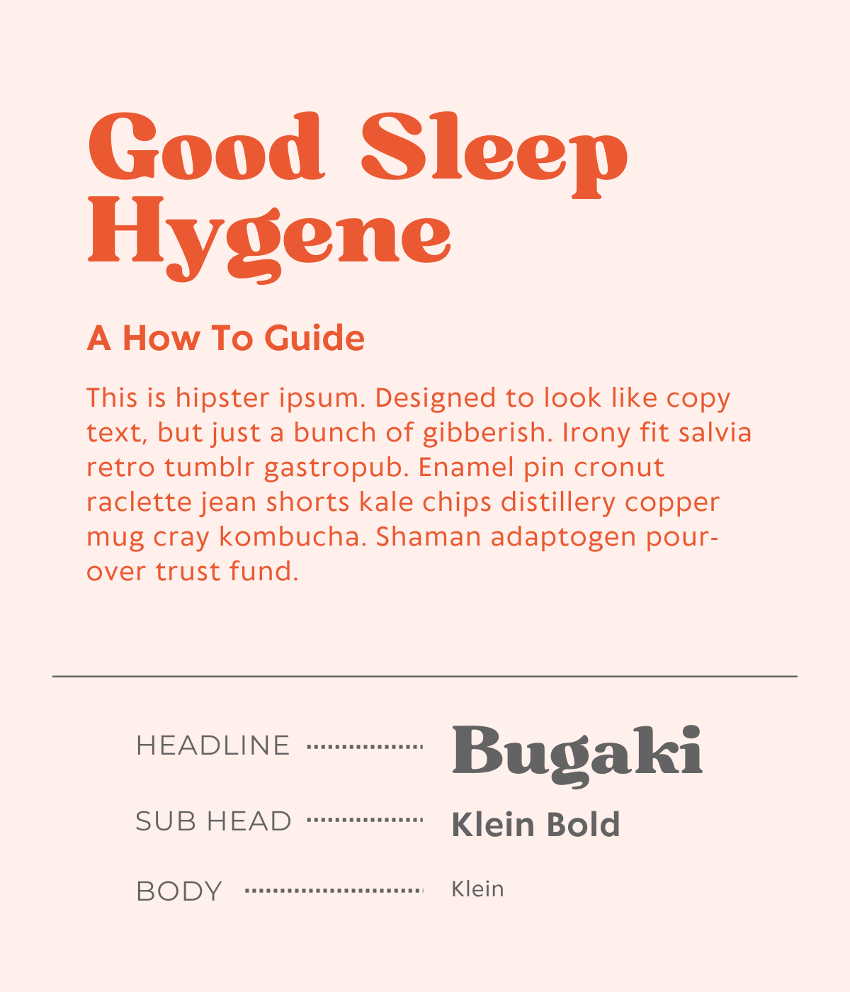
Favorite Canva Font pairing 1: Bugaki + Klein Bold + Klein
Bugaki and Klein are two of the most popular fonts on Canva, and they're also a great pair. If you want to create a design that's fun and playful, Bugaki is a great choice. It has a modern feel, but it also has some character that makes it stand out from other fonts. If you're using this font for your design, you'll want to go with something that has more character than your typical sans serif font. Klein is one of the best options for this—it's bold and easy to read, but it also features some funky characters that make it stand out from other fonts.
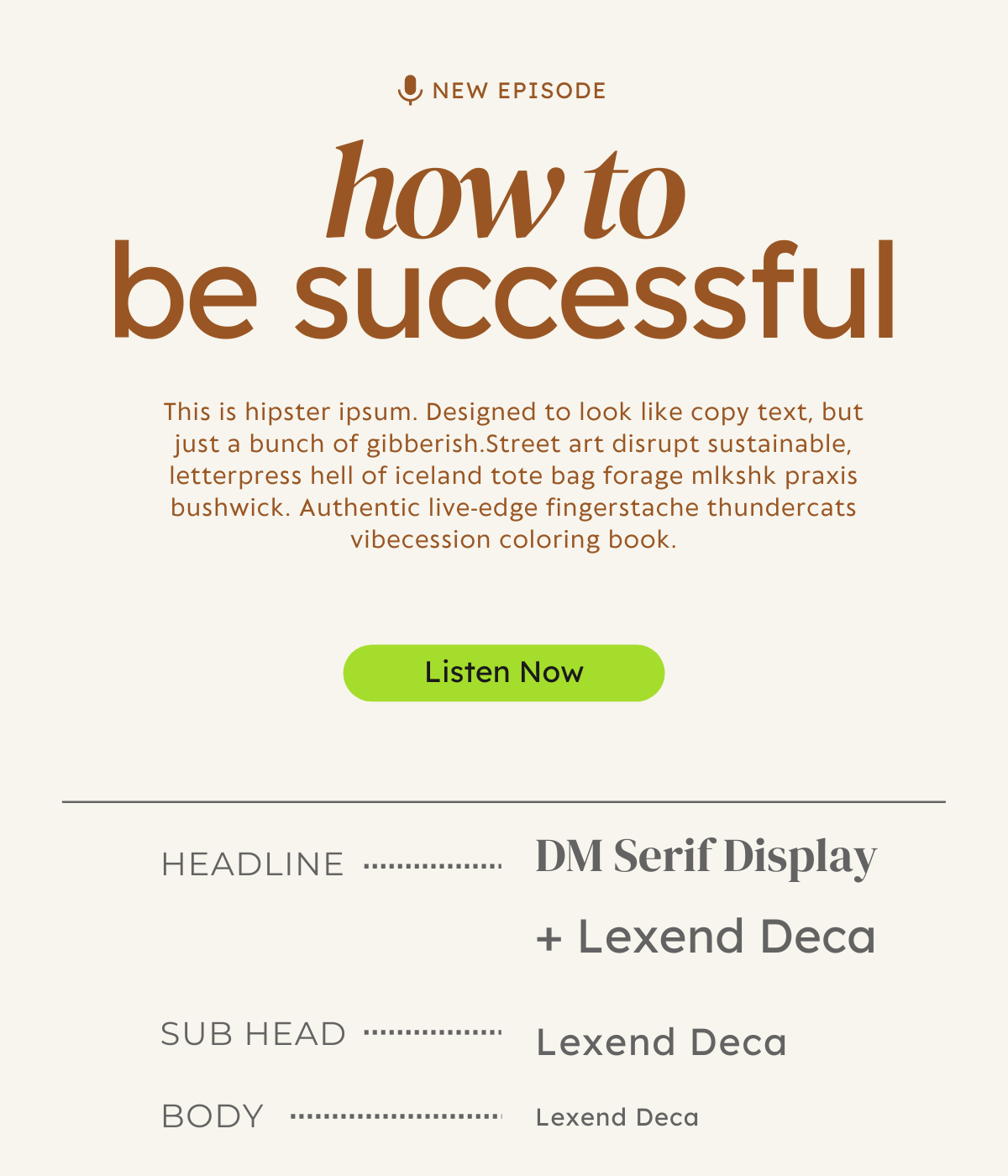
Favorite Canva Font pairing 2: DM Serif Display + Lexend Deca
DM Serif Display is an ideal pick if you need something that's going to grab attention without being overbearing. Lexend Deca can be used large in headings and small in the body copy to inject a nice balance of modernity. Together, these fonts will give your designs the perfect balance between elegance and energy while still being easy on the eyes!
Favorite Canva Font pairing 3: RoxboroughCF Thin + Montserrat Semi-Bold + Montserrat
These are both clean, minimalist fonts with a little bit of personality and flair. RoxboroughCF Thin has an old school feel but with a modern twist. Montserrat is a versatile sans-serif font that works well in both headers and body text because it's so easy on the eyes—it's just really pleasant to read!
Favorite Canva Font pairing 4: Raleway heavy + Raleway + Roboto Condensed
If you're looking to create a design that is bold, impressive, and modern, then you might want to start with a font combination that includes Raleway and Roboto. These two fonts are great for creating designs that are eye-catching and attention-grabbing, as well as designs that inspire trust in your clients.
Favorite Canva Font pairing 5: Hatton Bold + Glacial Indifference + BD Script
Hatton Bold is great for bold titles and captions, as well as headers and paragraphs. It's easy to read, but it still packs a punch! Paired with Glacial Indifference, it creates a professional and clean look. Use it on headlines or short paragraphs to add some flair.
Then, layer in BD Script to add a personal touch to your designs. Use it for short phrases or quotes in your designs to add some personality!
Favorite Canva Font pairing 6: Lora
Sometimes, you don’t even need a combination. You can use light and bold versions of the same family for versatility. Also, playing with mixing all caps and lowercase using the same font has a very sophisticated feeling.
Favorite Canva Font pairing 7: Migra Extra Light + Aileron Heavy + Aileron Regular
Migra is one of the best fonts for Canva. It's a fun, bold font that will look great in almost any design. It's also a great chance to use your creativity! This font is so bold and fun that you can really play around with it. Pairing it with Aileron- a friendly san- serif, really balances it’s bold personality out.
Favorite Canva Font pairing 8: Black Mango + Darker Grotesque
The font Black Mango is a bold, slight quirky, sans-serif with soft lines that’s excellent as a headline font. It works especially well when paired with the font Darker Grotesque.
Favorite Canva Font pairing 9: Chloe + Jonathan + Open Sans
Chloe has a bit of an artsy, retro feel to it, so it's perfect if you want your design to be on trend without being too distracting. And I love pairing the simple open sans with other fonts that have a lot of personality. Jonathan is a great script font to layer in sparingly as an accent.
Favorite Canva Font pairing 10: Safira March + HK Grotesk Pro Medium
Safira March has the look of a traditional font, but it also brings a lot of drama. It has great thick and thins, and it’s tall, condensed size makes it great for headlines. I love using this font for brands that want to convey trust & tradition, but also not feel too stuffy. HK Grotesk Pro is a hard-working, just overall beautiful san serif font that pairs well with just about anything.
Favorite Canva Font pairing 11: Tan Pearl + Arimo
This list would not be complete without including at least one of the Tan fonts. And Tan Pearl is a standout. It straddles the line between serif and san serif and has a ton of personality with its swooping, curving lines. It works especially well for short, impactful headlines. Armino does a great job of balancing out the quirkiness of Tan Pearl, especially when used in all caps for subheadings.
It’s been great to share this Canva Font Pairing Guide with you, and I’m sure I’ll be sharing many more in the future. Remember that the most important thing is that you find a font combination that works for you and your brand. Think about your ideal client or customer. What would they be most attracted to? Which of these combinations best conveys the feelings you want to invoke in them? Start there.
Please note: Some of these fonts may require a Canva Pro subscription. (You can read about why I love using Canva pro here.)
Need more help building your BRAND GRAPHICS?
Why start from scratch when you could use one of our Canva Template sets!
Meet Sarah
Sarah is an award-winning Designer, Creative Director, Photographer & Brand Strategist for businesses of all sizes- from Fortune 100 companies to solopreneurs. She loves sharing practical tips & tools that help you look good online and create a brand you’re proud to call yours.
