Squarespace makeover: Basic blog to a multi-layered branded online destination
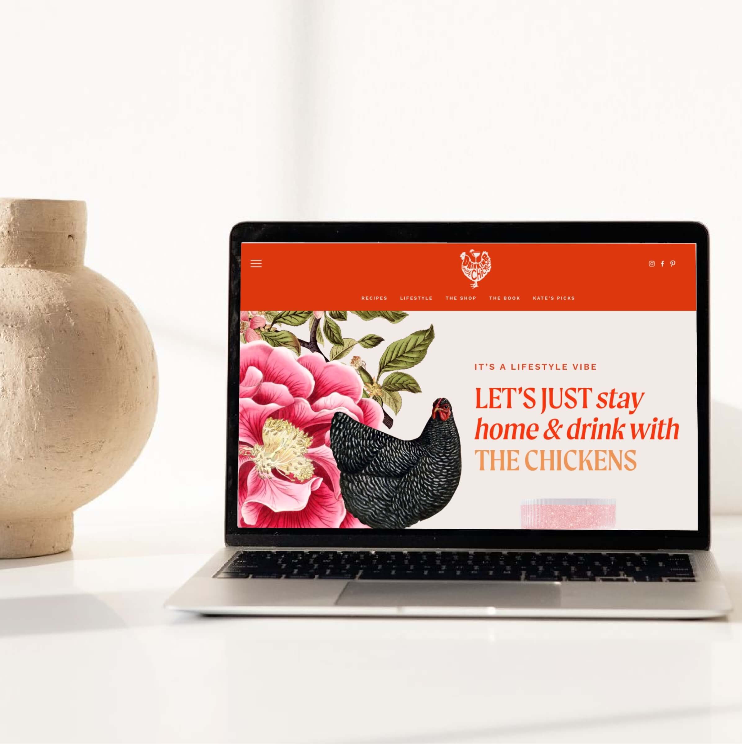
Kate Richards had an amazing project for me - her website, Drinking With Chickens, needed to be completely redesigned. We decided the best approach was to merge Squarespace and Shopify into a hybrid website that packed a lot of punch in terms of both lifestyle content and e-commerce shopping.
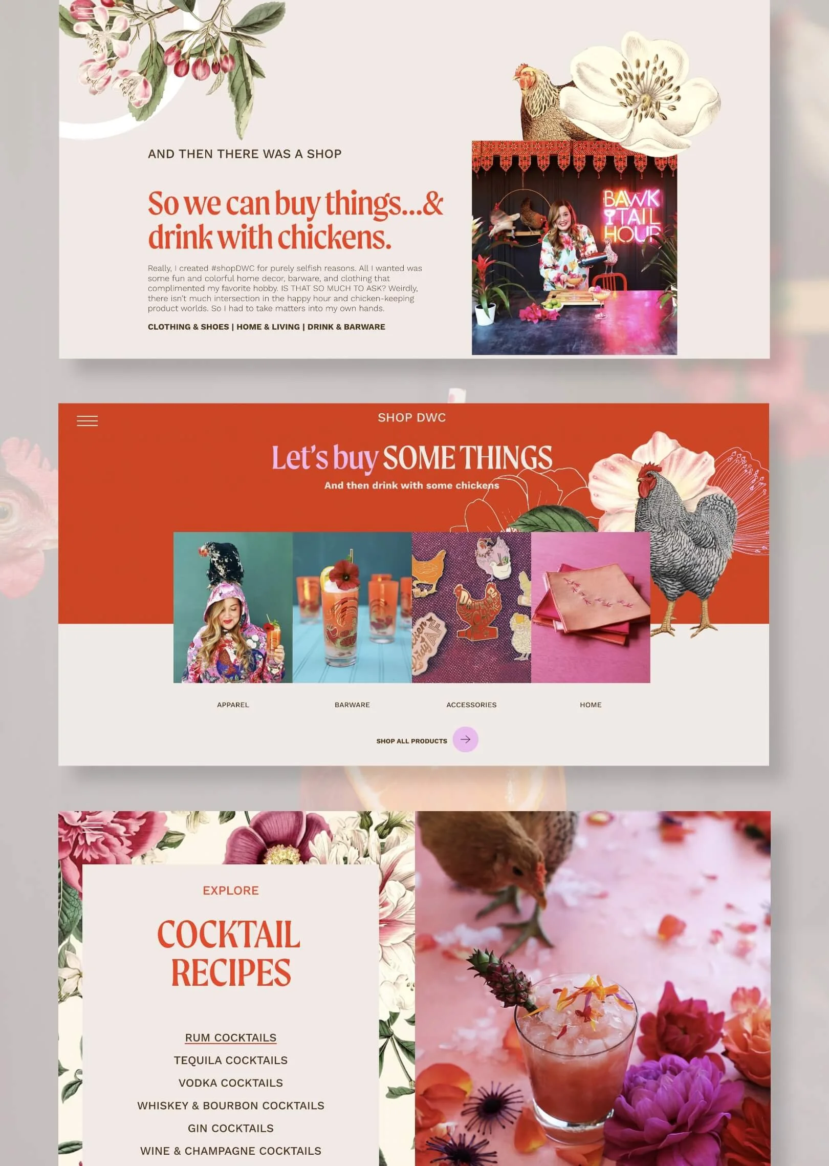
The finished website was designed to have a creative, quirky, and colorful aesthetic that fit with DWC’s brand perfectly while also streamlining the user experience- blending a robust shop and lifestyle website into one seamless experience.
Working on this project was such a treat as I’ve gotten to watch Kate’s business grow over the years and even provided photography, art direction, and styling for some spreads in her beautiful book.
It was definitely time to upgrade the website to better show off how far she’s come!
When she came to me with this project in mind, in her words, her current site was a “dated, basic bitch, cookie-cutter template that was not functional enough for my multi-layered brand.”
Her photography has always had a gorgeous, tongue-in-cheek vibe, but the design of the site was not keeping up with the aesthetic she had cultivated and was known for on Instagram.
Ready to evolve from DIY Squarespace website design
Not only did we want the new site to reflect the bold, colorful, whimsical world of DWC (she describes her brand aesthetic as Jimmy Buffet meets Joanna Gains), there were some significant organizational/ User Experience issues to figure out.
Kate was an early adopter of Squarespace, using their website builder to build her own site. As her business expanded and grew in complexity, though, so did her site. She quickly found that what had seemed like a good idea — a DIY website — didn’t match the multi-layered vision she had for the brand.
The result? A cobbled mess of various elements and a design that didn't reflect the image of her brand she had in her head, leaving her feeling frustrated and embarrassed.
Website redesign goals
Drinking with chickens is first and foremost a lifestyle brand that centers on fresh-from-the-garden cocktails. But there is also a shop with hundreds of products- that was built on Shopify- an entirely different platform than her main site.
Also needed: a press features page, a brand partnership/ services page, a page to feature and market her book, and a wholly new “favorite things” affiliate product section that was easily searchable & shoppable. As a popular influencer on Instagram, we knew this could be an amazing way to add passive income to her site without using ads.
But let’s back up a minute to those cocktails and blog posts I mentioned… I also saw an opportunity to curate sections around the site that organized her hundreds of blog posts in a way that was functional and easy for her users to navigate. Drawing them further into her world, and spending more time on the site.
Squarespace website design strategy
Before even diving into the aesthetics of the site, I developed a strategic plan and sitemap for how the site could effortlessly incorporate all these needs and take visitors on a journey of discovery through the Drinking With Chickens world.
Brand Identity Upgrade
Additionally, Drinking With Chickens had a great logo, but none of the other parts of the brand identity had ever been properly defined. It was more of a “fly-by-the-seat-of-your-pants” type of branding situation.
So I also set to work defining brand colors, fonts, and graphics to incorporate into the Squarespace website redesign and all other marketing materials moving forward.
The lifestyle blog & shop website redesign results
A cohesive, seamless experience that combines Shopify and Squarespace together in perfect harmony, Kate now has a unique, vibrant, branded website destination she can call home- ready to nurture and delight its loyal fans - all while earning her more money!
Visitors can easily find products to purchase, explore hundreds of DWC blog posts, and easily hire Kate as a content creator for sponsored posts.
Additionally, many integrations have been put into place that will help her earn more passive income from all the new site visitors she’s attracting.
Ease of Squarespace + Custom design and CSS coding
This is the power of Squarespace, and why it’s the perfect platform to transform an average blog into a unique website.
Utilizing its powerful features, plus my signature custom CSS coding for Squarespace, I was able to create something truly unique that stands out from the crowd, while also still allowing Kate to have the same, effortless user experience on the backend of her site when adding new blog posts or content. For instance, with just a couple of clicks (because of the tagging organization I implemented for her blog posts), she can change out her seasonal recipes on the homepage without the assistance of a web designer.
Win. Win.
Are you ready for a website upgrade?
We should definitely chat. Get in touch here.
Meet Sarah
Sarah is an award-winning Designer, Creative Director & Brand Strategist for billion-dollar companies turned entrepreneur. She loves exploring the areas where business, branding, and personal growth comingle to create magic. And she’s also passionate about empowering entrepreneurs with easy tools to transform the way they do business.


